

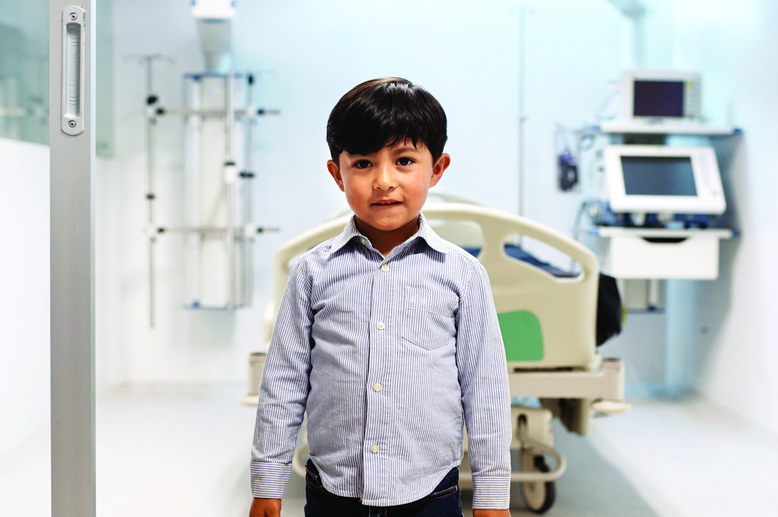
Because of childhood illnesses
Because of childhood illnesses
The Pediatric Research Foundation conducted a three-year exploration of its identity and mandate. The deeply introspective process was prolonged by the pandemic, but at its end, a few key findings emerged:
These conclusions led the Foundation to make a bold decision: it was time to change its name and adopt a new brand identity.
The mission? Create a new image aimed at dispelling any confusion and instantly communicating the Foundation’s ambitious cause.
The team worked on the Foundation’s brand guide, defining its essence, typography, colours, and graphic elements to ensure visual consistency.
The logo, resembling a playful creation built from children’s blocks, embodies pediatric research. It merges the simplicity of a microscope with colourful shapes. The logo highlights the Foundation’s enduring commitment to progress and innovation, thus illustrating its continually evolving approach.
This combination also symbolizes the need for a universal and collaborative commitment to advance science for children’s health.
The new tagline, “Accelerating cures for kids”, expresses in a concise and impactful manner the purpose and vision of the Foundation, reflecting its unique role as a universal accelerator in pediatric health.
Once this transformation was accomplished, Atypic applied this new identity to the Foundation’s website, offering a coherent and captivating online experience.
This change allows the Foundation to assert its unique role among the public, to rally its partners and donors, and to highlight the researchers it supports as well as their accomplishments.
The team took up this new challenge through various communication initiatives ranging from relationship marketing to telemarketing with a particular emphasis on social networks, during two distinct phases.
The first phase consisted of introducing the new name and image, increasing the number of followers on the Facebook page, and directing traffic to the new website. This strategy was implemented using simple and effective visual elements, such as motion design animation and static images.
The second phase aimed to raise awareness of the Foundation as a key player in pediatric research while increasing the number of Facebook subscribers. here were three 15-second videos containing inspiring testimonials which were produced in collaboration with Comme des filles Productions. Des Images focusing on emotion and humanity were used for the broadcast of the videos to maximize their impact.
This campaign not only engaged the community, but also allowed the Foundation to highlight its mission on its revamped website.
The adventure continues with the creation of a manifesto that brings to life the values and mission of the Foundation. It is currently being broadcast on social media so that the organization’s name continues to gain wider and wider recognition.
Here at Atypic, we’re confident that with our team of dedicated experts together under one roof, we’re the only agency able to meet all your needs! Have you got a cause? Put us to the test!